Does beauty matter? Well, when it comes to landing page design, it can undoubtedly have an impact on how your offer is seen by your audience. If your landing pages do not seem professional—or if they do not adhere to certain best practices—your conversion rates may suffer. Let’s take a close look at the most effective Landing Page Layout that inspires your next design.
A landing page is one of the most powerful and adaptable digital marketing tools available today, and its effectiveness is being demonstrated in an increasing number of cases. In addition to this, we will discuss the essential elements of a user-friendly and effective landing page design.
How can you attract visitors to your landing page and encourage them to make a purchase?
Although numerous landing pages differ in look and employ a range of exciting strategies to engage visitors, they always serve the same basic purpose. These pages encourage visitors to progress to the next step in the purchasing process.
How to Design a Beautiful Landing Page?
Landing pages are fairly similar to regular websites, they are used for a specific purpose. The following are the most important characteristics that contribute to a landing page that looks amazing and converts well:
- Align your landing page with your ad campaign goals.
Keep your focus on the target while creating a landing page. What advertising campaigns will be used to bring traffic to this page? What is the aim? As a result, ensure that the language on the website corresponds to the language in your advertisements or vice versa. If your advertisement reads, “Get unlimited internet!” The landing page should describe in detail how to obtain free internet access.
- Reduce the complexity of your forms
Though forms can play a significant role in the design of landing pages. Make sure you just ask for the information that you actually require. Try to keep the number of input fields to seven or less. Understand the value of whitespace. When you’re not sure, always keep things simple.
- Make sure your CTA buttons are impossible to miss.
The use of an attractive call-to-action button can have a dramatic impact on your conversion rate, therefore you don’t want to neglect this step when creating your landing page design.
It’s a good idea to make CTA buttons different colors and use action-oriented language in their text. Make use of terms like “Get my free account” and “Book a call immediately” to encourage them to take action.
- Keep the design easy to navigate and straightforward.
Your landing page design should be consistent with the colors of your brand and appear to be something you’d like to have on your website. As well As, along with making your forms simple, you should make the whole page easy to use.
- Avoid endless scrolling.
Keep your paragraphs brief and straightforward. Yes, if you have a specialized technology product and need to give a large amount of information to assist your leads in gaining clarity, go ahead.
However, in the majority of circumstances, long pages are completely unnecessary. Consider it a physical advertisement. Which would you prefer to present to your potential customers: an attractive brochure or a wordy volume?
- Make your landing page responsive.
You must ensure that your landing pages are compatible with all devices and screens. Many ready-made landing page solutions have this capability, allowing you to preview typical sizes before releasing your new page.
Tip: Keep your buttons and/or forms centered on a full-size page with a single-color background. As a result, shrinking and stretching on whatever odd screens your page may encounter is less likely to break something critical.
- Ensure that it loads quickly.
Load time could be the cause of a high bounce rate on a specific page. With one-off landing pages, it can be tempting to cut corners, but make sure nothing on the page is excessively heavy or large. Resizing is a time-consuming process. Additionally, if your landing page does not load quickly enough, it can damage any SEO efforts you have made on the page.
How to create a Landing Page without a Website?
Having a landing page doesn’t need to have a website. Landing pages are separate, stand-alone pages.
Additionally, the tools for creating landing pages no longer require a high level of technical understanding, which means that you or any member of your team can construct a landing page, host it on a domain, and begin converting web traffic.
Historically, websites have been the backbone of online marketing campaigns and commercial presence. Allow people to find out about your brand and services, tell them about your products, and do a lot of other things on the internet.
Even though the world of Internet marketing is moving toward social media, websites are no longer the only way for businesses to get started.
You can increase conversions more quickly if you begin with landing pages.
Difference Between Landing Page & Website
When a landing page is compared to a website, there are numerous similarities, but also some significant distinctions. Understanding the distinctions can assist you in determining when to use a landing page or website.
This can also assist you in determining whether your website or page interacts with your target audience and selecting the most cost-effective solution.
Website:
Because your website is bigger, has more features, and costs more money, it’s ideal for attracting more customers and displaying more complex ideas. A website is most beneficial for established firms or organizations because it may assist in responding to client issues or complaints and provide usefulness.
Landing Page:
A landing page should be straightforward, easy to understand, and serve a clear goal. It’s important to remember that landing pages are designed with a specific audience in mind rather than the general public, and they usually focus on a single concept. Typically, the notion is promotional in purpose, with the goal of attracting a potential lead. In most cases, it is linked to a webpage.
| LANDING PAGE | WEBSITE |
|---|---|
| A single web page that appears in response to clicking on a search engine optimized search result or an online advertisement | Set of web pages, including multimedia content that can be identified with a domain name |
| Mainly a single page | Multiple web pages |
| Contains some specific information | Consist of all the information the customer wants to know |
| Covers a single functionality | Covers multiple functionality |
| Limited navigation | Many navigation links |
Examples of Best Landing Page Layouts
1) Zola
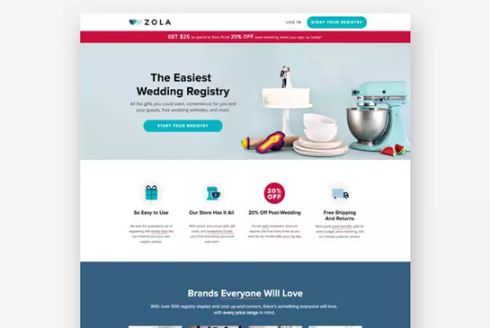
If you work in the wedding industry, such as Zola, you understand the importance of design. The preceding example page demonstrates the company’s design prowess by serving up a simple, gorgeous landing page for brides and grooms-to-be.
2) Dcode – SaaS Landing Page
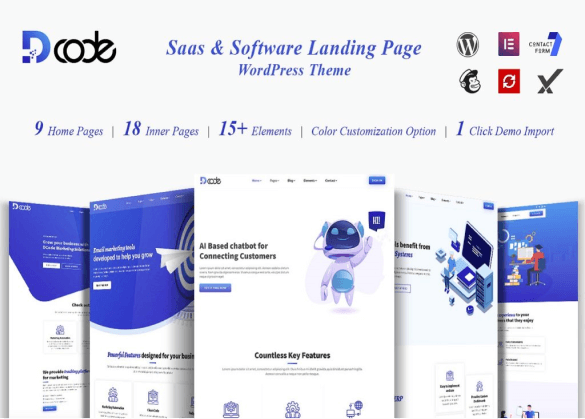
DCode is a responsive, graphically attractive Modern WordPress Theme. Designed specifically for SAAS-based software products/services applications to exhibit the software product’s features and offerings via DCode-based landing pages. It’s user-friendly designed and well-coded, so can customize it easily. The designs are developed prominently for users to easily understand your software products/services.
3) Wheels – Automobile Multipurpose Landing Page
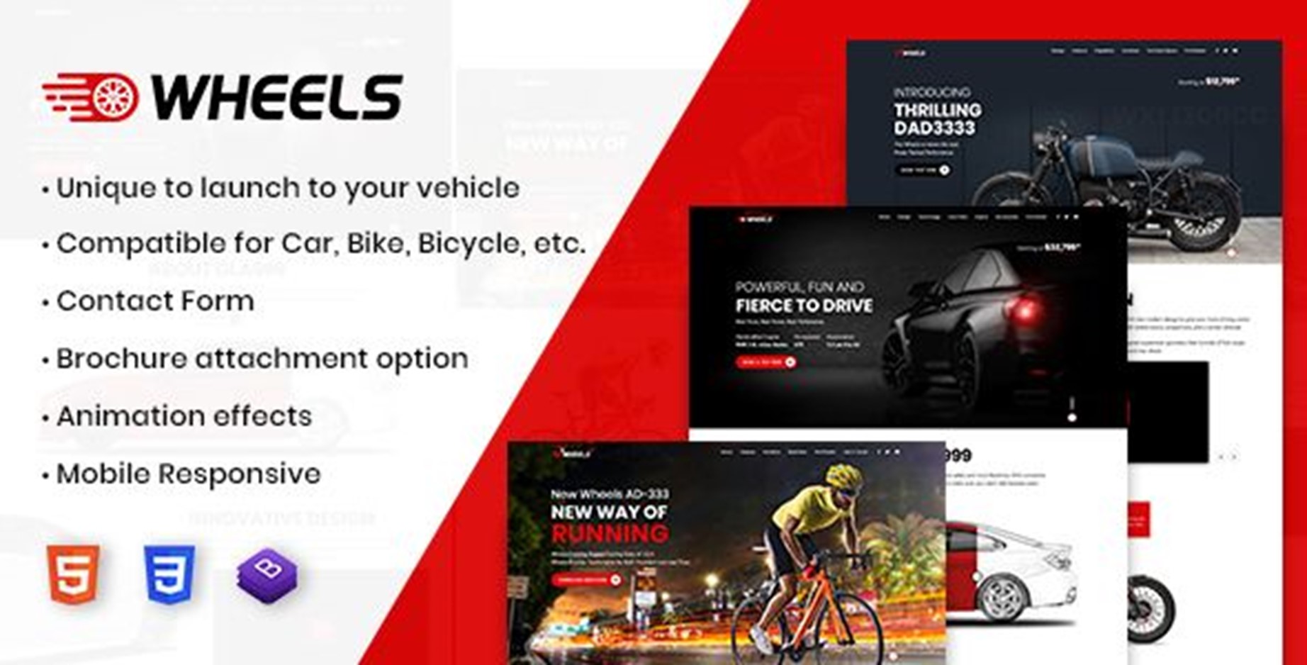
Wheels to create a killer landing page for your upcoming vehicles like cars, bikes/motorcycles, bicycles, etc. which is you are going to launch. Furthermore, Check out amazing layouts and features for your next-generation vehicles you can show to your customers.
4) Lujo
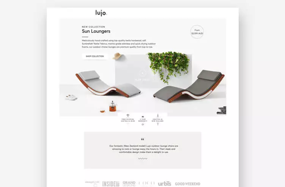
This Z-pattern landing page for Lujo was created by the conversion experts at the digital firm KlientBoost. It provides an abundance of context without becoming overpowering. One could argue that there are two calls to action here—to shop the collection and to watch the film. Lujo is able to get away with it because the movie is displayed subtly, as an extension of the product images. Clearly, the most crucial CTA on this page is to peruse the lounger selection.
5) Panoply
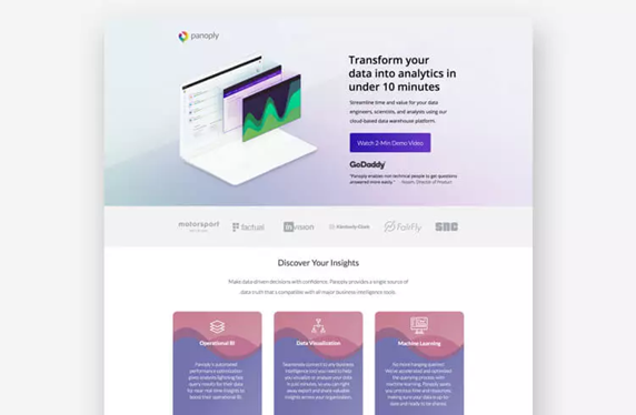
Unlike some of the other examples, Panoply’s data analytics software does not have a very visually appealing product to showcase—after all, it is analytics software, not a stylish suit. However, Panoply’s landing page (created by Directive Consulting) is a stunning example of how design and aesthetics matter even for technical B2B products and services.


