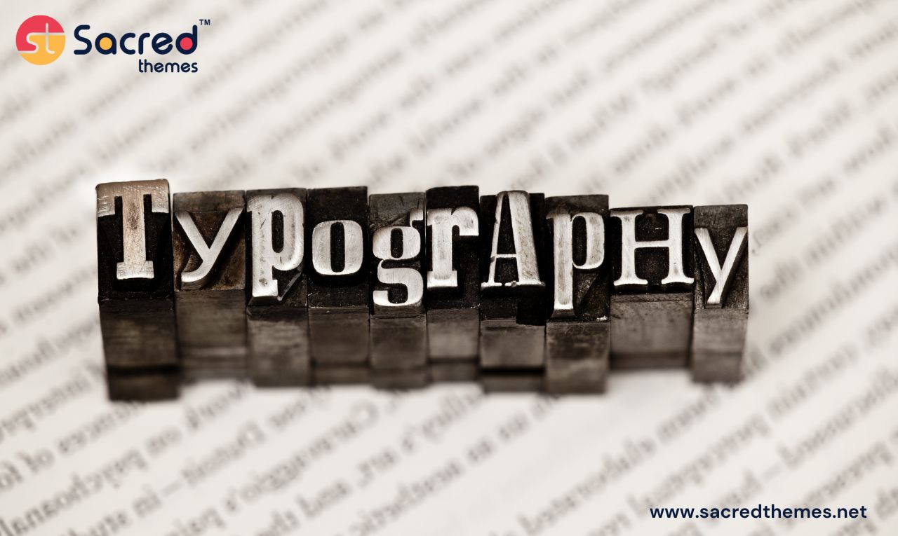
Typography is one of the most important parts of your website. The design of your site will significantly improve with the use of proper text settings and well-type branding. Let’s explore how to implement Typography in web design.
When creating a website, it is important to use the right typeface and color. Web visitors are often confused by too much text displayed on the same page or by different fonts in the same heading or body text.
Typography plays a big role in communicating messages with your customers, so you must understand how to use it well.!
Let’s understand with an example.
This Wheels – Automobile Business Multipurpose And Responsive HTML Template website design shows the color effect on headings to catch the attention of visitors. The design agency created a website with header colors red and white to distinguish content based on its purpose.

The SacredThemes Website Design and Development Agency simply enlarged its heading font size to make it easier to read on larger screens.
Every website must provide visitors with the appropriate emotions, intentions, and facts in text format. This is where design and typography play a role. Typography is only one part of Web design, but it can be a vital asset for a brand.
Principal typefaces in Typography
Whether on the Web or in print, the way letters and characters look has a big effect on the reader. You’ve probably noticed this when you read books or look at the messages on your favorite social media site.
Typography is a style of design that uses a variety of letter sizes and weights, while a font is a graphic representation of how text is organized. There are four types of typefaces in typography.
- Serif – Conventional, Respectful, and Official
- Sans Serif – Causal, Modern, and Simple
- Slab Serif – Bold, Simple, and Strong
- Script – Elegant, Creative, and Decorative
The most common types of typefaces on the web are Serif and Sans Serif. Serifs are more formal, traditional, and consistent. They make long paragraphs easier to read.
Sans-serifs are more informal and straightforward than serifs. They function effectively on low-resolution devices and are the ideal option for web design. Both are frequently employed for text or headlines.
The main characteristic of the slab typeface, despite its intention to grab attention, is how thick and bold it is. The script typeface should only be used for exceptional events, such as for large headlines and other prominent text.
Importance of Typography in Web Design
Typography is much more than just picking a pretty typeface. It is an essential component in UI design.
Excellent typography produces an effective visual hierarchy, provides visual balance to a website and establishes the overall tone of your digital product, thus enhancing the user experience. Let’s delve a little more into the importance of typography.
1. It is a way to communicate
A website may be about a business, art, or a certain product. When you visit a website, it is straightforward to determine the type of content it provides. This is because of how the words are written.
The layout, colors, typefaces, and other aspects communicate with visitors and webmasters.
2. It helps keep the attention of your audience
Typography draws people into a web experience and helps to emphasize how important your message seems to be. This may involve the utilization of large or bold fonts. In addition, it may feature the combination of fonts with colors, emphasized text, and contrasting styles.
3. It helps establish the tone and feel of your brand
The tone and aesthetic of your brand are not determined by a single aspect. It’s the combination of different parts that gives users an overall impression. It interacts with your brand’s colors, graphics, messaging, and other design aspects to create an overall impression.
4. It conveys a specific mood or emotion
A piece of content could be a promotion for a computer game. It might have some exciting parts of the game. In this case, you should make the content fun, glamorous, and playful.
If your content is essential, you should choose simple, plain, and professional fonts. This typeface selection impacts how the content is understood.

5. It builds a hierarchy of information
The classification of texts within a material according to their importance is referred to as information hierarchy. You can use multiple font types and sizes to distinguish the most essential texts.
You can draw attention to the most important points by using larger font sizes. This will make it easier for the audience to evaluate which material deserves more attention.
6. It Gives An Excellent User Experience
Typography makes website navigation simple for users, and also helps people obtain the information they want when they want it. Make typography easier for users to make decisions and act.
It also helps your organization direct user actions and gives contextually relevant information. A smaller type can be utilized to meet email opt-in user complaints. You may also use text to highlight a CTA or essential information on a form.
Users might not be aware of the role typography plays in making a digital experience easy to use, but web designers will know for sure. This is the power of typography.
7. It Promotes A Consistent Brand Across Channels
Use typography consistently to create a brand that gives users a certain impression. This is especially true across platforms, as consistent typography strengthens your brand identity, whether on your website, in digital advertising or on a billboard.
8. It establishes and creates recognition
If you follow a typeface pattern and show your site with rhythm, it gives value to your corporate brand. People always remember the fonts they use when presenting visual effects.
Typography makes your company stand out and helps people recognize it. Each of your content develops the presence of your brand with the help of typography.
How to use typography in website design
- Choose a typeface that effectively conveys the core principles of your brand.
- Mix and match typefaces that are complementary to one another.
- Make use of headlines as well as several levels of visual hierarchy.
- Limited Line Length.
- Make sure there is enough space in white between each line.
- Make the colors stand out more
- Make sure you use the appropriate apostrophes and dashes in this sentence.
Conclusion
I hope you enjoyed this examination of typography in web design. When it comes to design, an understanding of typography in its broadest sense is essential. It is also essential to comprehend a website’s theme and sector.
As we mentioned earlier, fonts are important elements of web design that enhance its appearance. They convey the message in a more appealing and vibrant style. But don’t overlook their importance while choosing a font for your website.
Once you have this in place, you can start designing your website with some effective typography. If you need assistance creating stunning typographic designs for your website… Reach out to SacredThemes.
Happy Designing…!


